Classics
Like I said, there are several teams that have stuck to simplicity amid the trend to difersify, and a few have done so with fantastic results. It seems like a lot of these programs are teams that have been elite for decades, which makes a lot of sense. People know immediately who they're looking at, so don't fix what isn't broken.
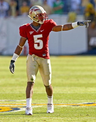
Texas
I'll get this one out of the way. I'm a UT student so I'm inherently biased, but I've looked around and a lot of people agree with me. Texas has some of the best football uniforms on planet earth; the away jerseys especially. All white with burnt orange accents, they're basically the visual embodiment of less is more. The home jerseys are very similar, just switching burnt orange with white on the top.


Florida State
The perfect balance between two really good-looking colors. That helmet logo is among the very best in college sports. It sounds a bit ridiculous, but the word beautiful is perfectly fitting for these uniforms.
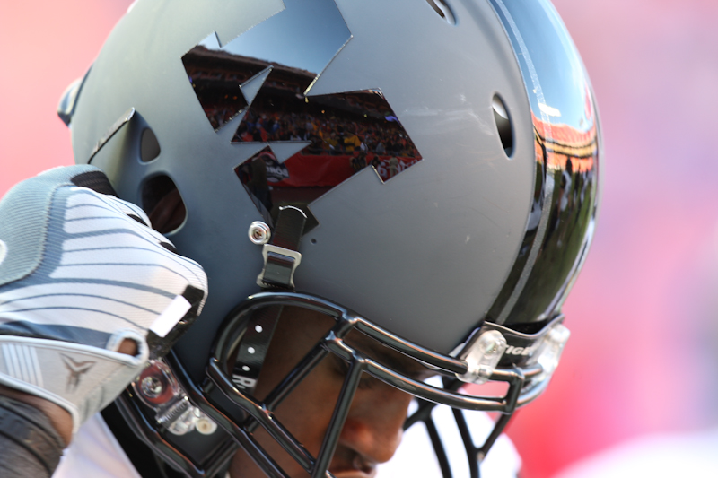
Ohio State
I'm definitely not an Ohio State fan, but I have to admit they have some great home uniforms. They're one of the few three-color uniforms I've seen that look truly great. A ridiculous number of teams have red as their primary color, but OSU's red is surprisingly unique. The helmet stripe is repeated exactly on the sleeves and the pants, a design chioce I like a lot. I prefer the helmets sans buckeye stickers, but everything is so simple they don't really distract you.

Also...
Michigan

Notre Dame

UCLA

Slick and New
Nike has led the charge on modern, varied, and multi-textured uniforms with their Pro-Combat series and their runway models at Oregon. A lot of these combinations can look really good, but there are some that transcend to classic status almost instantly.
Arizona State
ASU completely rebranded last year with the help of Nike, and it was a huge success. The new logo looks great, and all the jersey combinations are good. The all-blacks are the real standouts.

Oregon
Oregon has been the standard-bearer for Nike in their uniform experiments, and their jerseys seem to change every game they play. As many look really good as look ridiculous, but every once in a while a true classic emerges, and is promptly scrapped for something else. The Pro-Combat unis in their season opener vs. LSU were great.

I really liked the helmets they wore in the National Championship game last year, too.

Missouri
My family raised me as Mizzou fans, so I'm biased to black and gold. Also, Mizzou has been the beneficiary of some of the best Pro-Combat unis since the series began.

LSU
LSU benefits a lot from making the gold of their Purple and Gold... actually gold.

Also...
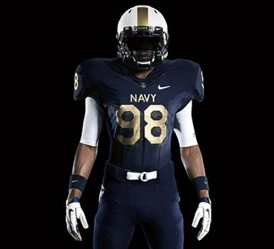
Navy
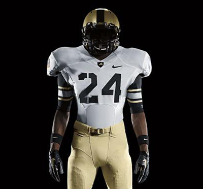
Army
And Finally...
The most talked about uniforms this season by far were the ones Maryland unveiled in their opening game against Miami. Definitely the most striking unis so far, they featured patterns from the very unusual flag of Maryland, and they were almost universally panned by crotchety ESPN analysts. The Maryland players seemed to love them, though.
I'm going on record as saying I like the infamous flag uniforms. They're a great way to rebrand a program that has struggled in the ACC and needs a jolt. Obviously uniforms won't make a tangible difference on the field, but they create interest and are uniquely Maryland's. Sure the patterns are wacky and bold, but the rest of the uniforms are simple white, so there's a pretty good design balance.

Fantastic blog post and very useful information. I must appreciate the brilliant work by brilliant writer. Keep blogging.
ReplyDeleteConcordia is a U.S. News Top Tier Regional University and has been named by The Chronicle of Higher Education as one of the fastest growing private nonprofit master's institutions. CUI enrolls over 4,000 students.The classics colleges Thank you.
ReplyDelete